Considerations
*First off i will use one type of brush when i draw in this manner.
"Airbrush soft - round" - size dosent not matter as im sure youll change it sporatically.
*On a side not, the pictures can be clicked on if you want to see the steps in greater detail, this is kind of required during the "metal" phase as i am too lazy to save smaller copies of my work.
*SAVE OFTEN, and it also pays to name your layers... you will have lots.
* Also all colours used are made available on the corresponding Step.
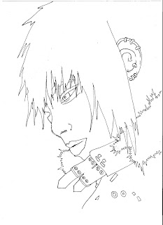
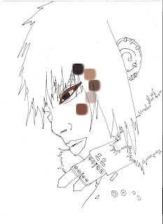
Step . 1 and Step . 2
Step . 1 - Either draw a picture and scan it in or just use my one right here.
If you are going to draw one. include some metal things, like buttons and something fur - like. As this tutorial explores the very basics of skin, hair, metal and fur.
Step . 2 - Create a new layer over your sketch, personally i would recommend setting it to "multiply" it just makes things easier and gives your drawing that sketchy look. Now when im colouring i tend to start with the eyes and work my way outwards, no matter what. Use a medium brown and outline the eyes with your brush. Its nice to start with "wooden" typed colours for 2 reasons, they absorb + melt togethor well and also able to be configured later on much easiler than the rest of the colour wheel.
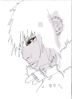
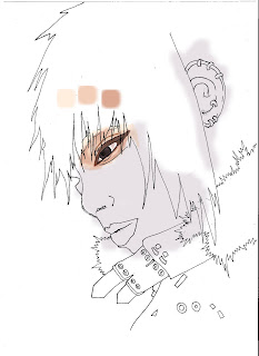
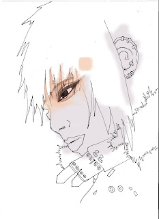
Step . 3 , Step . 4 and Step . 5
Step . 3 - Create new layer, might as well keep it normal as this is just setting a backdrop for what will become your skin colour. Fill in the rest of the skin with a lavander colour.
Step . 4 - Create a new layer again and set it to "multiply" start with a very mellow peach colour and start working your way around the eyes. Take your time and use the lightest of the colours provided first and slolwy move onto the darker shades. I tend to zoom in here abit and use a brush size of about .15.
Step . 5 - Create a new layer, however this time set the layer to "normal". Reduce the ocapity of the brush to something low, i use 17% but this is debateable, find something that feels comfortable for whatever strokes you make. Now using a soft peach colour slowly start to branch out and paint more outwards around the eye. Take your time, and use colours from the previous step to establish a sense of depth in the tonal configuration.
Step . 6 - Create another layer, keep this layer as "normal" otherwise your tonal colours are going to become very dark, very quickly. Using a reduced opcaity on your brush
(Opacity - 17% or possibly even lower) continue to colour in the area around the eyes. Try to blend the colours togethor and spend time making it look smoother.
This step spend time paying attention to...
*The inside of the eye- using a light red/brown colour.
*The eyebrow/s , simply use a bark colour, that isnt too harsh or dense.
*The eyebrow/s , simply use a bark colour, that isnt too harsh or dense.
*The "eyeliner" use a medium brown here to just make the eye more smooth, more rounded.
*The iris of the eye. If you want to give the eyes an intense look use lighter colours. I have used a light grey here.
If your drawing coloured eyes, make sure you outline the eyeball with a thin layer of black to add imperative to the eyes.
Step . 7 - Recreate the other eye using previous steps.
Step . 7 - Recreate the other eye using previous steps.
Step . 8 - Create a new layer, make this layer "normal" and using the peachy colours provided create a thin layer of peach (Low Opcaity) over the skin. Then begin working on just defining the outline of the nose and chin with heavier peach colours.
Step . 9 - Create a new layer, make this layer "normal" set a low opacity brush
(Opacity - 17% is always a good start and make it higher the more confident you become)
and use the colours provided to colour in the face as you did previosuly around the eyes. Its always good to start off light and work your way to dark i find, but whatever you feel comfortable with.
Step . 10 - Continue your work on the ear. If your like myself and were stupid enough to not colour in the ear/s as you were colouring around the eyes then youll have to start from scratch, i have however supplied all the colours required.
Step . 11 - Now it is time to colour in the lips. Traditionally you would go a lighter shade of red, pink, purple or maroon. Iv decided to go for something more different and keep an earthy brown colour. Keep the top lip darker from the bottom. Dont just make the shade different , use a different colour. It also pays off to gently brush a few strokes of low opacity over the bottom lip, once again personal preference.
Step . 12 - Spend time here smoothing over the skin and just tidying it up. When your happy with how it looks its time to give the image a soft glow. Merge all layers togethor
(EXCEPT THE FIRST LAYER WITH THE SKETCH ON IT - you only want the sketch there as lines of refrence, NOT in the final image.)
Duplicate your background and on the layer go..
*Filter - Blur - Gaussian Blur - 5 /10 Pixels
Afterwards adjust your opacity on the same layer until you get it the way that really speaks to you. I tend to keep mine at 7.5 Pixels and 45% layer opacity.
Step . 13 - Create a new layer here, make it "multiply". Now this only really seems applicable to my picture and if you have your own here your going to have to improvise. Time to colour in the clothing. I have picked simply automatic black and simply coloured in the jacket.
Step . 14 - I tend to have trouble here as on my original drawing i have put lots of little buttons, zips and what not on. So to make things easier on me here i have super imposed the original sketch over my image again to show where they all are. The easy way of doing this is to just open up the original sketch on photoshop, then...
*make sure the layer isnt locked (if it is just double click it in the tab menu and click ok)select - colour range - and click on the white background, this should highlight everything that isnt a line, and remove it all with the eraser or simply hit "delete". Then its a simple matter of dragging the line work over to your current image in progress.
Create a new layer, make it "normal".Now you have all your buttons and metal bits back and visiable use a medium shade of blue to give the impression of a shadow on everything metal. In this case, the buckles of the jacket, buttons and ear rings.
Step . 15 - Ugh alright so i apoligise i didnt save all the images i ment to and have skipped a step, thats alright its pretty easy to explain. If you look back at the previous step picture, all you need to do here is fill in the blank white spots on everything metallic with a darker shade of blue on the same layer as Step . 14.
Step . 16 - On the same layer where all the metal objects have been coloured get your burn tool, and burn the sides of everything metallic. Then when your happy switch to your dodge tool and highlight the lighter parts of the metals and start to make them shine.
Step . 17 - This is more of an optional step and unless you look closely it wont make a dramatic difference. If your keen to play around with metallic colours then go..
Image - Adjustments - Colour balance
And from here then just have a play around. I decided to use an increase of red and a decrease in blue to get a purple like sheen going on. If you have a larger quality of metal in your picture this step becomes very important, however as my picture contains lots of little bits, none are really noteworthy and this step is more just for the hell of it.
Step . 18 - Create a new layer, make it "multiply" to begin colouring in your hair!
Now i think its imperative to use the "lasso tool" when creating the "shape" of hair. I have kept a soft outline with creating this picture , which is easily achieved by setting your
"lasso tool" to 1px and anti - aliased. Use a basic colour first when starting the hair, the bark brown i have given is an excellent way to start off. Use the lasso tool to create a basic outline of the hair you want to create or as in my case just to make sure you colour within the lines.
Step . 19 - I began to get annoyed with having my super imposed sketch and thought it was bringing down the look of the overall image so just started off by deleting the layer with my oringinal step 1 linework. The next step here is to make a new layer , make it "normal". Now using your lasso tool start making various patches of hair with alternative shades of brown.
Step . 20 - Use the magic wand to select an a shade of hair and its now time to draw details for the strands of hair. To get really thin strands of hair switch your brush to 1px and start to make random strokes. Since my hair kind of comes straight down the majority of my marks were downward strokes. Used 5 seperate colours for the hair strands here, its good to use between 5 - 8 colour variations as it just gives volume to the hair.
Step . 21 - Here i got very slack as it hit midnight as just wanted to jump into bed and watch a dvd. So i apoligise that i kind of half gave up on the picture, as you can see i just bothered with a single patch of hair, normally you would bother with the rest of the head and hair. When you reach this step its here you can start to have alot of fun with the hair. Be sure to create layers just in case.With hair use dark shadows on the top and bottom as it gets to the centre of the strands it fades, its good to keep the roots dark. In this step make sure your layers are set to "multiply".
The pictures above DO NOT SHOWCASE my next suggestions,
theyre just there to look pretty.
a) To make your strands look more detailed, you can use "sharpen" certin areas to make them stand out more.
b) For higher grade area shadow and lighting using the "gradient tool" works wonders, i find the colour to transparent ratio works well. Spend time experimenting with light direction and different gradient colours. It is important to note that you can keep making lots of areas with the lasso tool.
c) Alternativly add lighting areas with the "Dodge tool", remember the goals are to get from lightest to darkest or vice versa.
Step . 22 - When your all finished and happy with how the hair looks its time to add the soft glow finish. Repeat Step . 12 here - however the catch is only to merge the layers that contain work on the hair. This can be easily achieved by lock/merging the layers containing work on the hair.
Step . 23 - Fur is very similar to hair, make sure you continue to use your "Airbrush soft - round" brush. Make a new layer, make the layer "normal". Get the lasso tool again and create the outline of the fur, use a tan colour for the default colour.
Step . 24 - Once your done, create a new layer , make it "multiply" and using a medium brown lightly colour the centre of the fur, its kind of important to not colour in too much. You will want some white outlines when your done for the next few steps.
Step . 25 - Create a new layer again, make this layer "normal". Use the same brown in the previous step. This time however lightly make some blurry around the section we have just created. Once again make sure you dont colour in too much.
Step . 26 - Make a new layer , once again and this time put it to "normal". Use the light tan colour again and begin to add small light strokes. Make sure you orchestrate your strokes outwards as this should situate a fur look, and furthermore i would do this quickly, a rougher approach makes it look more natural and fur-like. Keep repeating this step until your as happy as a meerkat.
Step . 27 - Like the hair, here is where your able to have fun with this step. So ill offer up a few suggestions.
*It is important to make sure you stroke outwards.
*Make some sections the darkest with the burn tool.
*Sharpen up some areas.
*Blur some other areas as well.
And on a final note its kind of fun to create a new layer, set it to "colour" and trace a few strands of fur in a soft pastal colour, for example i threw in a bit of baby blue.
Total time taken - 5 hours.
Its also not finished yet, i have only half completed the hair and it needs much MUCH more touching up work. but this tutorial is simply to show the basic principals behind photoshop painting.
Its also not finished yet, i have only half completed the hair and it needs much MUCH more touching up work. but this tutorial is simply to show the basic principals behind photoshop painting.


+copy.jpg)


